VIVARO.ME / PRODUCT DESIGN
One platform. More ways to participate.
A social-first Vivaro.me concept connecting content, game discovery, sports and rewards across desktop and mobile.
Explore the Figma file ↗
The assignment asked for a new Home / Social Feed and 2–4 additional experiences. I designed a shared product shell for five experiences: the feed, casino, live casino, sports and challenges. This is a completed recruitment concept—not employment at Vivaro or a released product.
01 / BRIEF
Beyond a social-network reskin
The brief’s central constraint was to make gaming and entertainment a natural part of the social experience, rather than bolt betting onto an Instagram clone. The opportunity was to connect discovery, participation and progression without making every screen compete for attention.
A social entry point
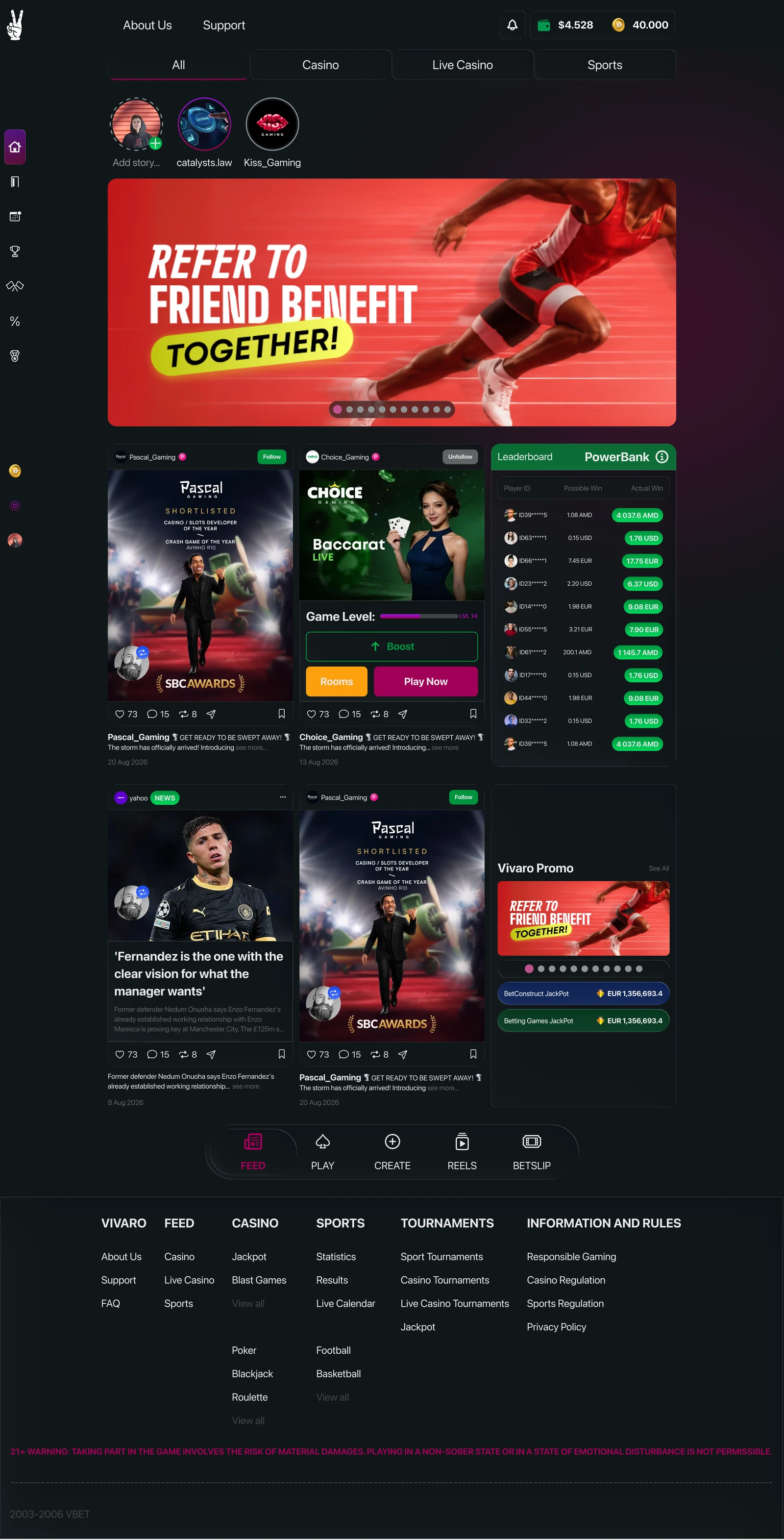
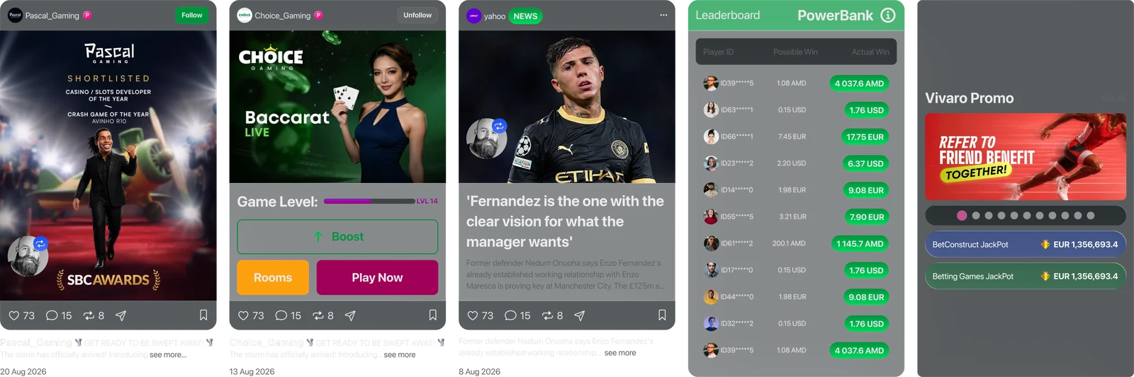
Stories, creator identities, follow controls and familiar post actions establish the feed. Game cards, news and community rankings then share that content language.
A separate place to play
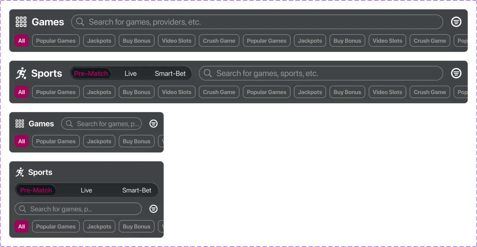
Casino, live casino and sports keep their own search and discovery tools. The Feed / Play / Create / Reels / Betslip dock preserves a shared orientation across them.
Progress with explicit states
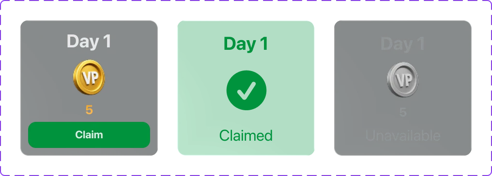
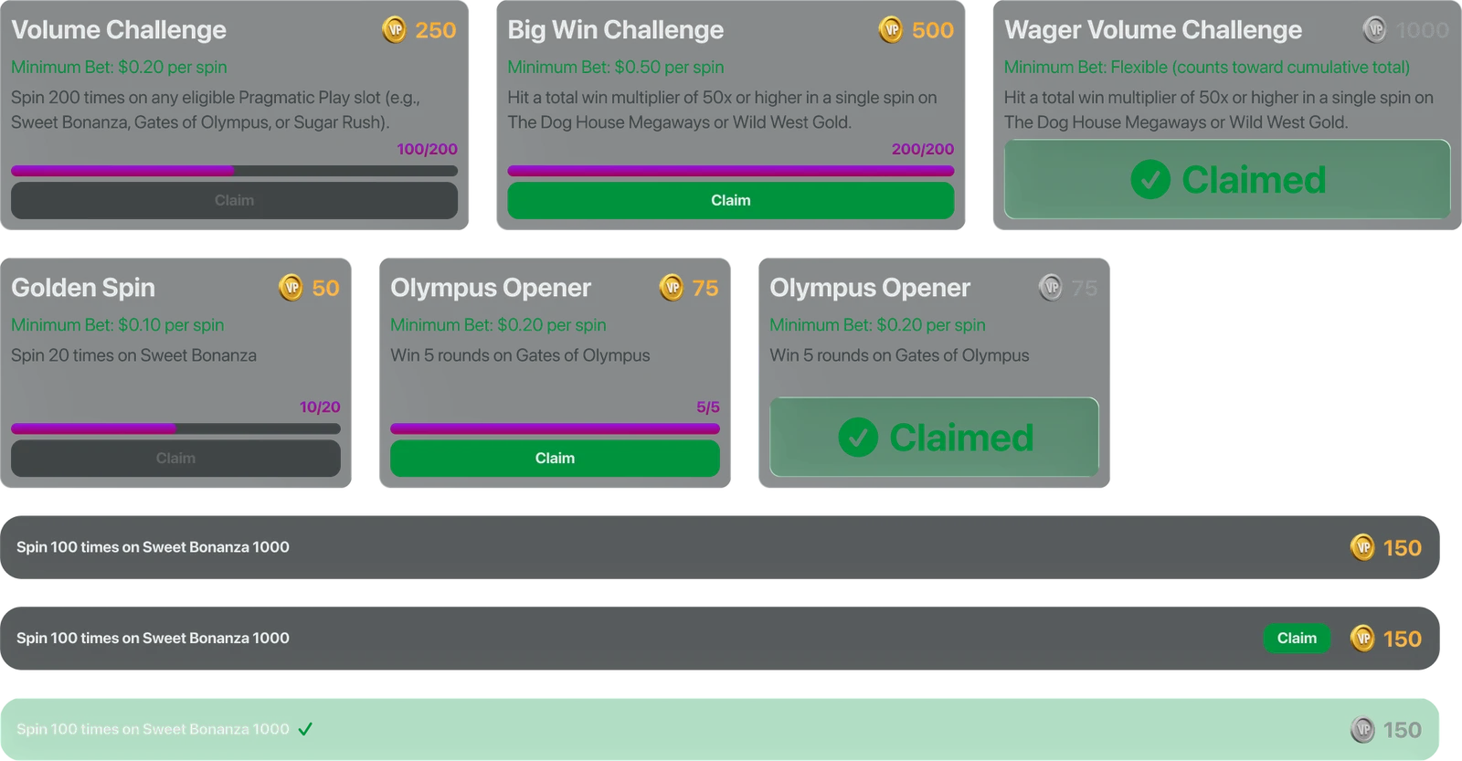
Levels and Boost appear inside game cards; daily rewards and challenges distinguish incomplete, claimable, claimed and unavailable states. These are design hypotheses, not proven retention improvements.
02 / UX → UI
From structure to interface
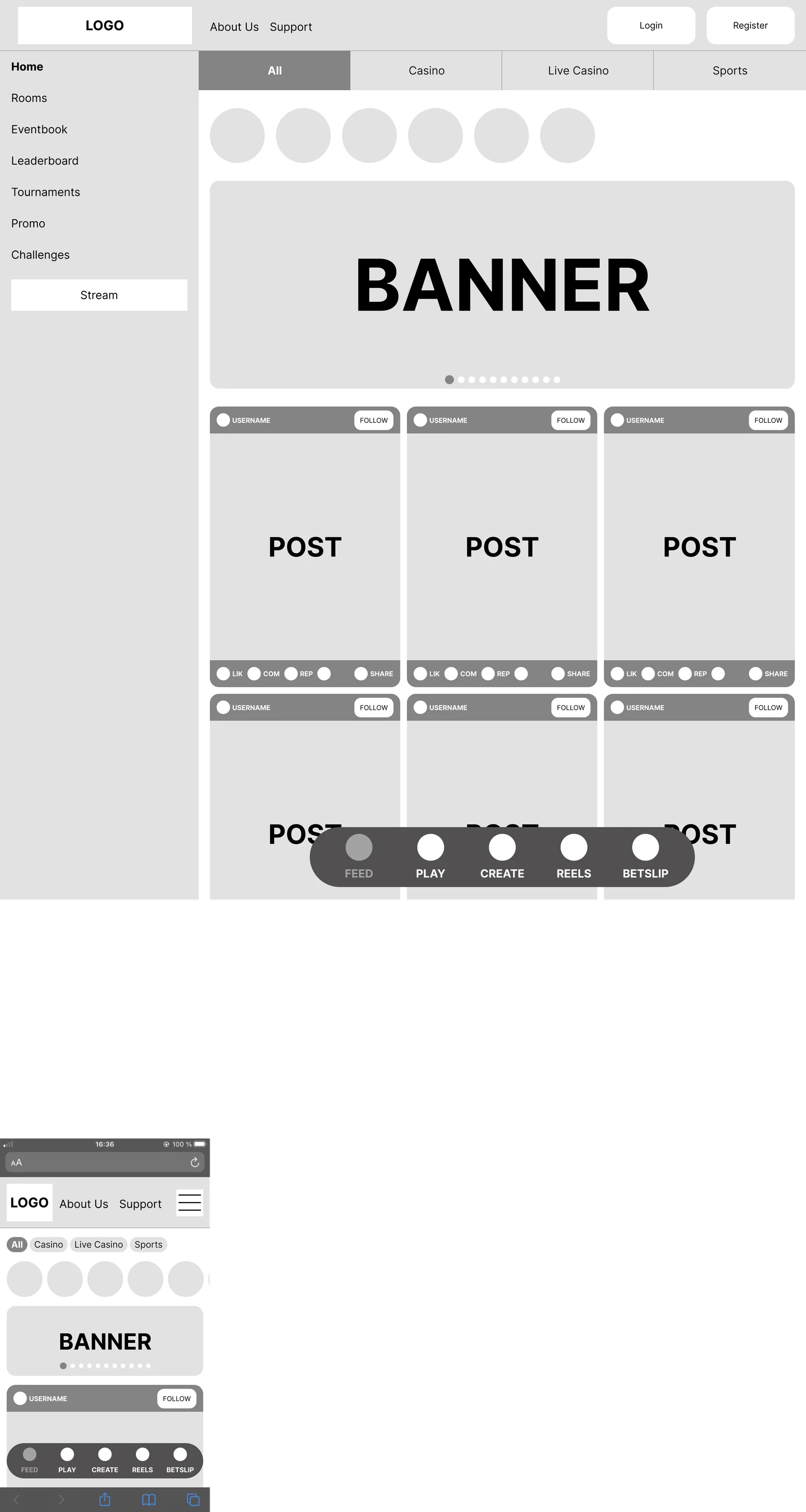
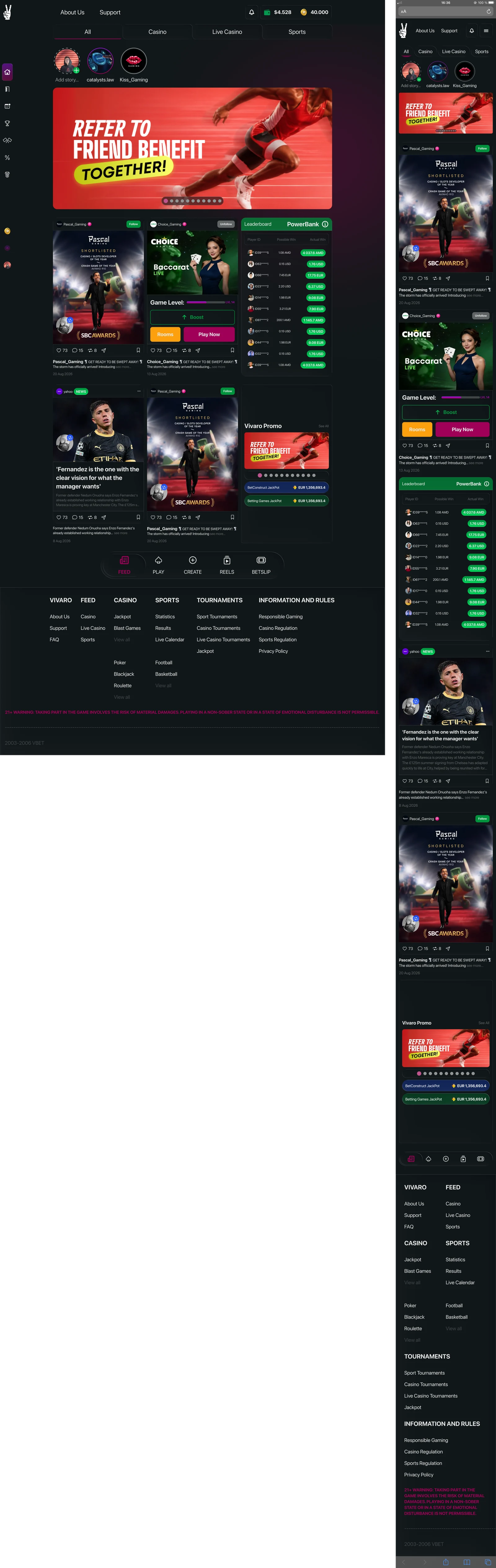
The wireframes establish the navigation, content hierarchy and discovery patterns before the high-fidelity layer. Desktop uses a multi-column feed and a side rail; mobile becomes a single-column sequence with a compact dock and expandable menu.
03 / EXPERIENCE
One shell, distinct discovery modes
The feed is the starting point. Casino adds promotional content and recent wins; live casino prioritizes tables and game discovery; sports introduces match suggestions, a collapsible Quick Bets module and competition lists. The same provider identity and card anatomy connect browsing with social content.

04 / CONTENT
The game becomes a social object
A shared card anatomy carries provider identity, follow state, media and engagement actions. The game variant adds a level, Boost, Rooms and Play Now. News retains its editorial hierarchy rather than pretending to be a game. This connects the ecosystem without making every content type identical.
05 / NAVIGATION
Navigation that changes shape—not meaning
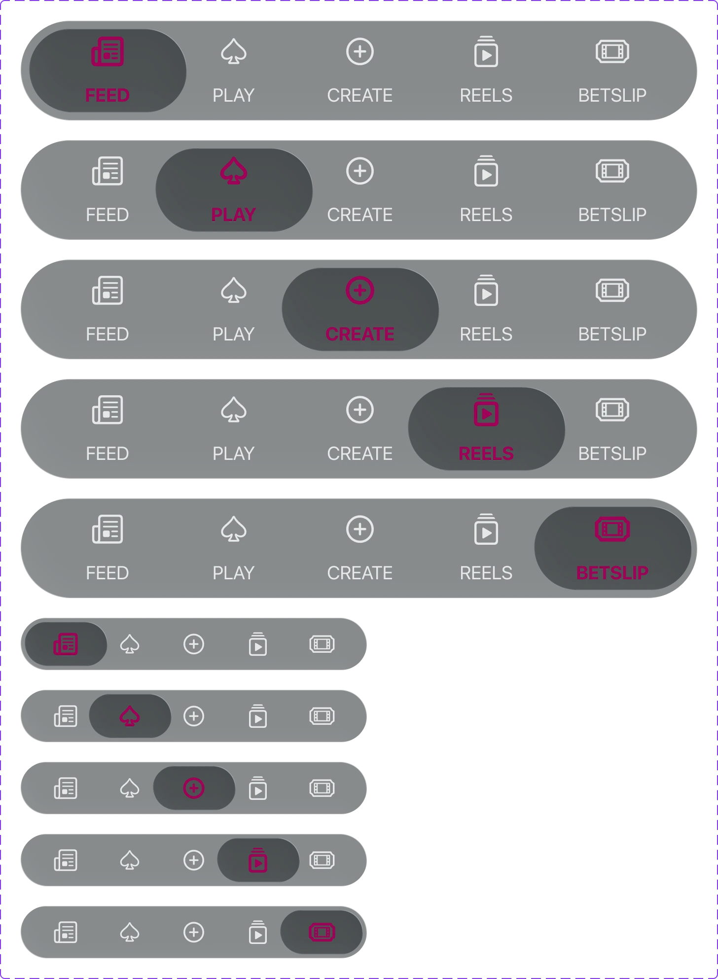
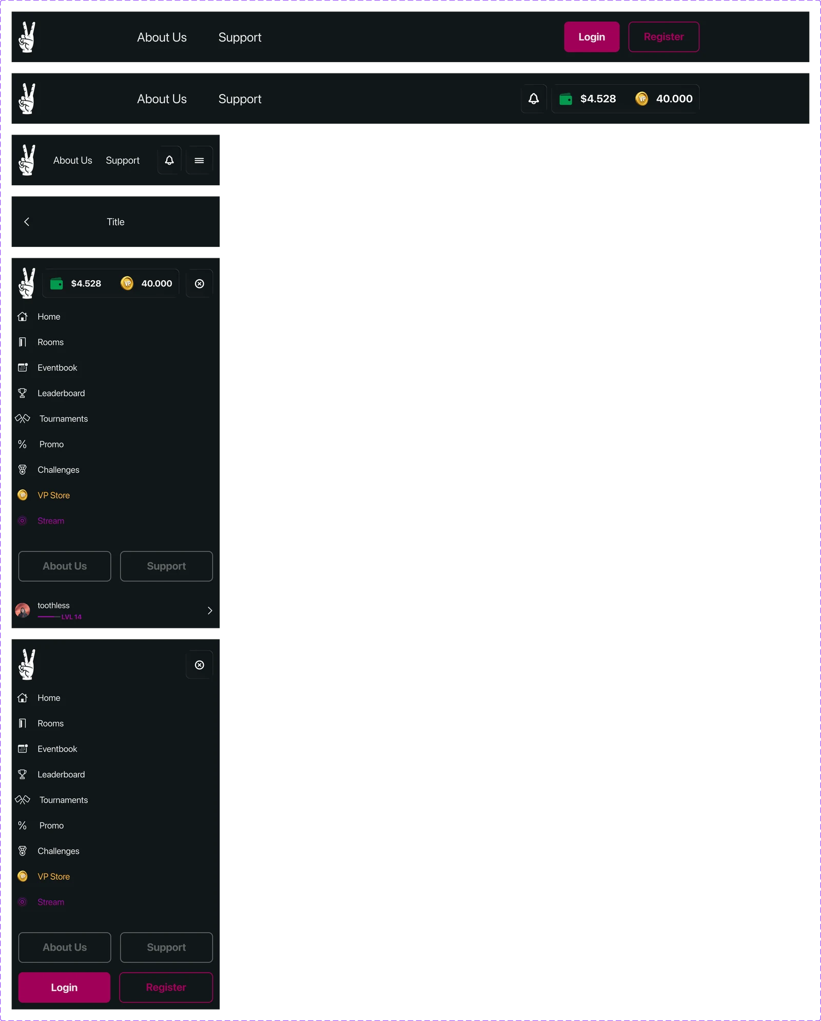
The desktop rail expands into labelled destinations; the mobile menu includes guest and signed-in variants. The five-part dock retains its destinations while dropping text labels in the compact version. Selected states use the brand accent, but the surrounding visual hierarchy stays consistent.
06 / GAMIFICATION
A visible next step
Daily rewards show what can be claimed now. Challenges combine a goal, eligibility condition, progress and reward amount, with separate disabled, claimable and claimed states. The design makes the status inspectable instead of relying on a generic reward badge.
07 / DESIGN SYSTEM
A system behind the screens
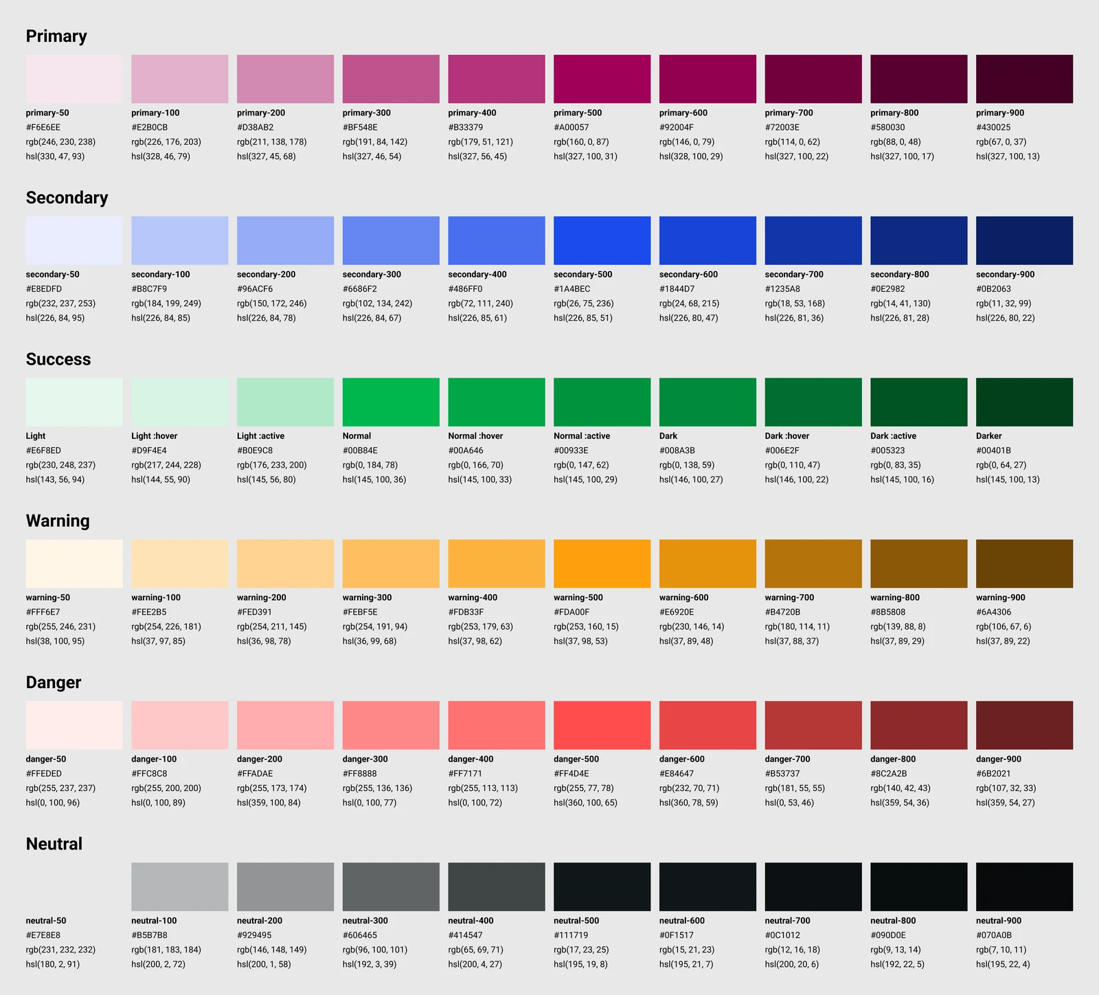
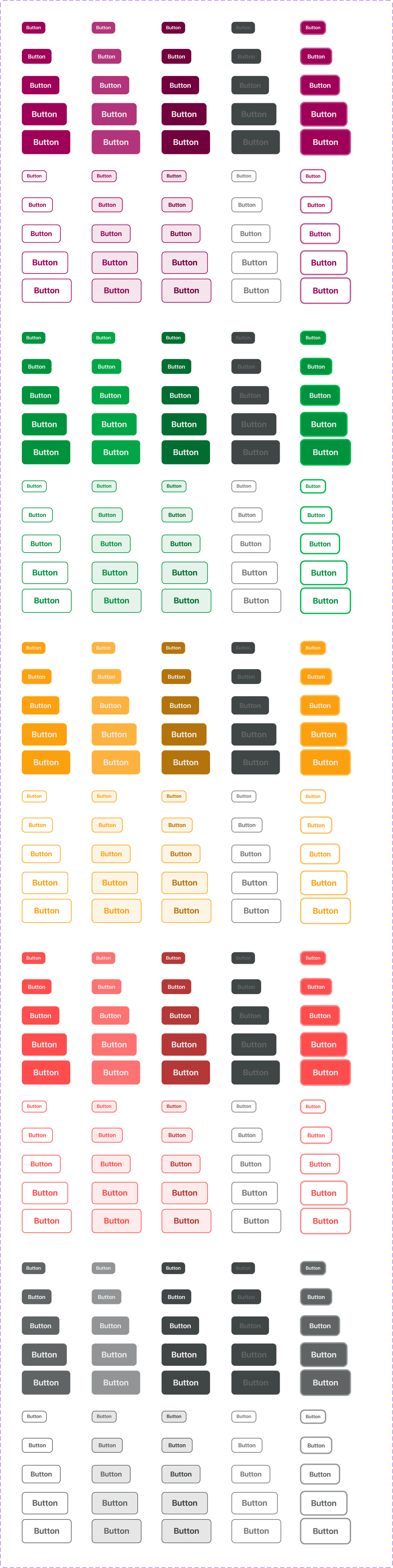
The visual foundation includes six color families, desktop and mobile type scales, button sizes and interaction states. Magenta establishes brand and selection; green, amber and red distinguish semantic actions and feedback. Shared tabs, search modules and responsive components carry the same grammar across the product.

08 / REFLECTION
What this work demonstrates—and what comes next
The result is a coherent design proposal with five desktop/mobile experiences, wireframes and a reusable UI kit. It demonstrates complex ecosystem thinking, not measured business impact. No user testing, conversion lift or production implementation is claimed.
Validate the hierarchy
Test whether people distinguish Feed and Play, understand Boost, and find games without being pulled away from their original intent.
Review accessibility
Audit small text, muted contrast, touch targets, keyboard behavior and compact dock labels before implementation. The exported mockups are not an accessibility certification.
Separate reward from pressure
Review challenges, promotional density and responsible-gaming visibility. The footer warning is present in the concept, but stronger in-context safeguards need product and compliance review.
Treat AI as a proposal
The AI Assistant is a designed match-suggestion interface. It does not demonstrate a working model, reliable predictions or validated betting advice.